Color plays such an important role in my work. As you all know (well some of you might at least), I adore black and white photography but have such a hard time creating anything without color. There is just so much that color can add to an image, so I find it nearly impossible to deny myself that extra layer to my editing process. Below you'll find five tips for achieving fantastic color in your images!
1. Don't Be Afraid of Selections
Some photographers go for more of a global route when color correcting, affecting the entire image all at once. This is totally called for and I definitely do it in EVERY single one of my edits, but in addition to global adjustments it can really punch your photos up a notch to select specific areas and adjust the colors accordingly. Sometimes I'll get very particular, like in this picture when I selected the dress and some of the smoke to change it to red hues. When it's called for, do not skimp on your selecting. Take the extra time to be sure you have a nice clean selection before making your changes, you'll be glad later when you don't have weird edges and areas colored that shouldn't be.
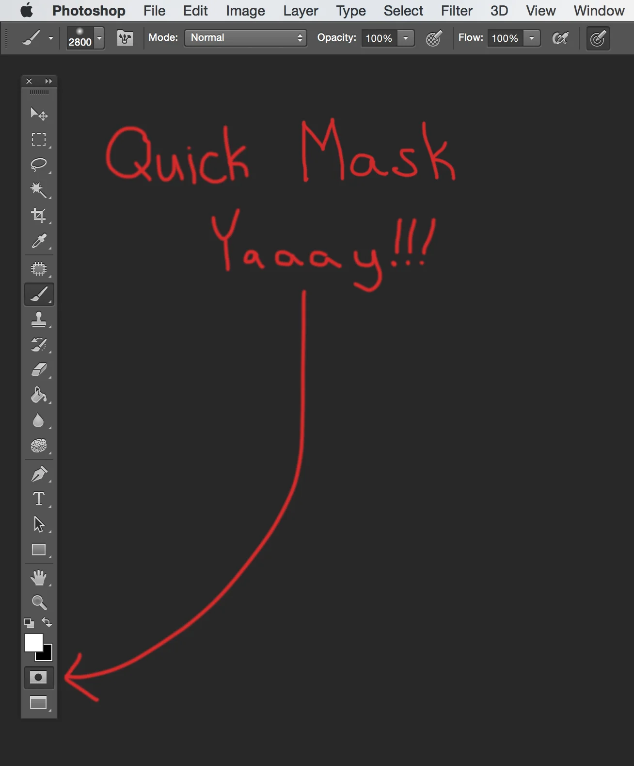
Not everything needs to have such a precise selection, though. Maybe you just want to make a general area a bit cooler or something - in that case one of my favorite tricks is to quickly make a loose selection of the desired area using the lasso tool and then enter the "Quick Mask Mode." (See image above please ... ) Click the button at the bottom of your tool palette and it'll make everything that's not selected turn red. Once in this mode you can actually apply a blur (I tend to go with a good old-fashioned gaussian blur) right to your selection to get a really soft super feathered edge. Now you can switch back out of Quick Mask by clicking the button again and make your adjustments on the adjustment layer of your choosing. You can only "feather" up to 250 pixels so I like to use this technique to get a very VERY soft edge selection. Try it - you'll see what I mean.
2. Color Is Not The Boss of You
Just because you don't have a red dress on hand doesn't mean you don't have a red dress on hand. (Wait what? Yes.) If you were envisioning an image of say, I don't know, a girl in a red dress turning into smoke for example, but you don't have a red dress, that's not an issue when you have Photoshop. (REJOICE!) It was really helpful that we did have a dress that was a peach-ish-pink color; it made it so that it wouldn't a big swing (that's fancy color correction talk for a color change) to alter the tone to a red. It was already kind of a red-ish tone to begin with. However, this dress could have been any color and you'd still be able to change it to green, purple, blue or whatever your little heart desires. (Whoa sorry, I mean I'm sure your heart is totally regular sized). One technique I like for a color swap like this is to use a hue saturation adjustment layer. It's stupid easy if you followed step one and already have yourself a polished selection of the dress (or whatever item it is you want to manipulate). You can just slide the top slider of the hue saturation window until you land on a color that you find pleasing, it's that simple.

3. Split Toning, Um ... It's Pretty Cool
Another one of my favorite techniques is "split toning." Like very many things in the mystical realm of photo manipulation, this method of color toning can be heavily overdone (sometimes people are going for that look and that's fine), but I like to use it in a much more subtle way. For those that don't know, split toning is from way back in the dinosaur days of dark rooms (I miss those days sometimes...). It's when you apply different colors to the shadows and highlights of a black and white image, but it can actually be done digitally to a color photo as well. Typically the color tones are opposite on the color wheel; my favorite direction to go with is yellow-ish highlights and blue shadows. One very easy way to do this is to pull up a "Levels Adjustment Layer," and at the top where there is a drop down menu that reads RGB, select "Blue." Then at the bottom you can move the sliders on either side inward a tiny bit (the farther you drag the slider in, the more colorized the shadows or highlights will be), and bing bam boom you've done it!! (Please see image above, SEE IT!) Like I said this can start to look really drastic, so use it sparingly.

The Left is with color correction and the right is without any color editing.
4. Adjustment Layers and Blending Modes
Adjustment layers and blending modes are both .... well, they are just flippin awesome. Alone they are some of the most powerful tools in my retouching tool belt, but together they are a force to be reckoned with. I know many of you (hopefully) have tapped into the endless potential of these two Photoshop features in your edits, but have any of you tried combining the two? Allow me to elaborate. One of my go-to adjustment layers for color editing is the "Color Balance" adjustment layer. This is another great way to push a bit of split toning into the image. I like to put a bit of yellow and maybe a smidge of red into the highlights, and some blues and cyans into the shadows. (You can select shadows, midtones, or highlights from a dropdown menu at the top of the Color Balance palette.) This adjustment can also brighten your highlights while darkening your shadows; you are essentially adding more contrast with color.

Sometimes I want to affect the colors, but I'm already happy with the brightness and contrast of the overall image. This is where the blending modes come into play. I'll often tweak my color with an adjustment layer and then set that adjustment layer to "color" in the blending mode drop down at the top of your layers palette. This makes it so that the adjustment layer will not affect how dark or light the image is, and will only alter the color. Also, when I was making the dress red I wanted it to be a bit darker, so I set a "Color Balance" layer to a "Multiply" blending mode. The possibilities are endless.

5. Just Try It
Really the biggest trick to great color editing of an image is experimentation. Have fun with it! For the technique I spoke of in tip 4, just go nuts! Try all different combinations of adjustment layers and blending modes to see what things do. Don't be afraid to wind up with a bunch of stacked up layers before you're happy with the color; my edit for this image has.... 11 color adjustment layers, so yeah less isn't always more.

I often don't know exactly what I want an image's color and feel to be, so I just start sliding sliders around. I'm a big fan of opening up an adjustment layer like "selective color" (one of my very favorites!!), and taking a slider WAY too far in one direction and then the other to see which way I want the color to go. Then I bring it slowly back towards the middle until I like it. Maybe you have a solid plan of what sort of colors you want your final piece to end up with, but then you mess around with an adjustment layer and stumble upon something you like way better. So dive in and start throwing sliders every which way - you never know what you'll come up with!
This image is the tenth addition to my "Dust to Dust" series.
