Sooooooo I made some armor. Not tangible armor, though (maybe one day). You see, the site ShiftArt.com does a monthly photo contest where they give you a selection of stock images to edit however you choose, as long you use a certain amount of them. This month the prize was a 13-inch Wacom Cintiq. So yeah, um duh, of course I was going to enter. I came in second place, but I still feel like I won because I ended up putting together this badass image that I never would have made otherwise. :)
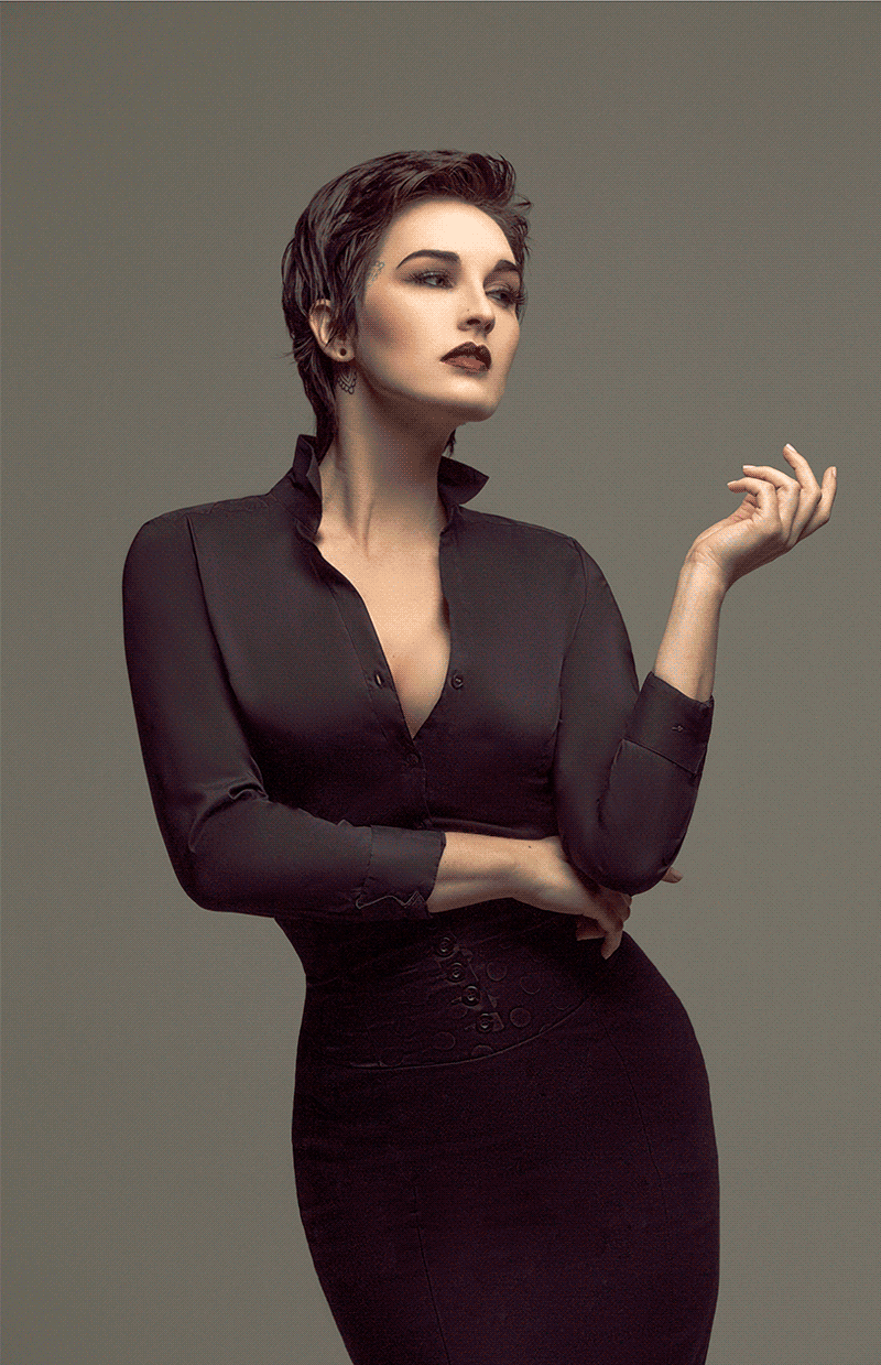
Of the handful of model images provided to be used for the contest, I decided to take a crack at the one with the pixie cut I was digging, and felt that the simple black silhouette would lend itself well to being the base for my armor. One of the other allotted images was of a crashed plane, and I thought all the little details and textures of the metal would make for some cool armor.

First I laid out the base layer of the armor. I used mostly the area circled in red from the side of the plane, and I retouched out a lot of the bigger holes. I did want it to look like this armor had been through some battles so I left the smaller scratches and dents, but I didn't necessarily want it to have gaping holes in it. I made use of clipping masks since I had the model masked off of her background, and also did a lot of "warp transforming" in order to have the lines and rivets of the metal flowing with the form of her body. Also you'll notice some areas like the shoulders look like a total crap salad. I knew I'd be adding croutons ... I mean shoulder pads and such, so I didn't take the time to blend those areas nicely since they'd be covered up later on.

Next I added some shoulder pads and ... hip pads? As well as the collar, belt, and ... crotch plate? Guys I'm clearly not an armor expert. For the shoulders there was a piece of the plane that really just screamed to be a shoulder pad (stop yelling at me, plane), so I had no choice but to listen to it. Then I used a tear-drop-ish shape from where the body of the plane joined the wing for the collar and hips. It already had a great gradient effect where it was darker teal down at the point which I rather fancied, as well as the little rivets along the edge of it.

I retouched out a couple of the unwanted cracks and things and then this piece got used several times throughout the rest of my image creation, including the collar, hips, crotch, and later for all of the smaller-inner-feathers of the wings.

Next I began to add some more tiny embellishments and details to the armor. I applied the "Polar Coordinates" filter to one of the provided textures to create the base for the round gems. (It's in the "Distort" filters of Photoshop's filter drop-down menu.) I ended up turning them purple later because the warmth of the original color was standing out too much from my cool color palette. I also peppered in some tiny porthole things from part of the front of the plane. I was really pleased once I added those in; I felt like they immediately gave some depth/dimension to the pieces where I added them.

As I mentioned earlier, for the inner part of the wings I used that same teardrop-shaped piece from the edge of the wing. Like the detail oriented spaz that I am, I hand placed each feather for about a zillion and a half hours. I sketched a rough outline of where I wanted the wings to be so I had somewhat of a "road map" as to how the feathers should lay, but it definitely took some trial and error before I was happy with the size/shape/position of the wings. The larger feathers were just selected from the main part of the plane's hull. I made a point to select some areas of the plane that would give me a similar grey to dark teal gradient like the smaller feathers.
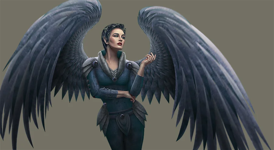
The next part of the process is always my favorite! PAINTING! I love the point when I've puzzled all my pieces together and I can start to shade and detail things with layer upon layers of paint. As per usual I have several different layers - Some layers set to "overlay" with very tiny shadow and highlight details accentuated. Some "soft light" layers with broader/softer/larger shading and brightening of areas. Some layers set on "normal," mostly for the darkest shadows, and more and more "overlay" layers for details followed by more overall layers later on. If I'm not making myself clear, thoughout my process I keep adding more and more layers of "paint" shading stacked up to get the desired amount of details and such. I also applied a motion blur to the outer part of the wings to draw your eye a bit more toward the center of the image, plus the larger feathers were looking a little too obviously flat and fake, so the blur helped to dampen that. Oh and of course I gave her pointy elf ears ... because fantasy.

For the background I used these two images below that were among the files provided for the contest. I actually flipped the Stonehenge image and used the gradient of the sky with the darker part at the bottom of my frame and then overlaid a desaturated version of the sunset image. I also painted on an "overlay" layer to brighten it a bit behind her head/shoulders and darken the bottom and sides some more.


We all know (well I would think most of you do by now) that I LOVE PARTICLES probably as much as I love the digital painting stage of my workflow. SO, when I saw that one of the stipulations for the contest was that you had to use one of the images provided by the RAWexchange Store, you knew I was 110% planning on using the particle image they provided. I set the layer to the "screen" blending mode, masked some parts of it away, and layered areas of it up a few times. Some of them I made much larger and stretched out with the transform and warp to give them some extra motion. Since I'm such a RAWexchange Store fan I also used some of their smoke textures from this set to give some extra interest and movement to the top of the frame.

Sooo yeah, I ended up using both of the files provided by the RAWexchange store. (I just love their stuff!!!) In addition to the particle texture the other option was a fancy purple-ish lens flare (below), and I tried it out at the top of my frame set to screen. Naturally I loved it and then took the time to paint in some purple colored highlights throughout the image to blend the new light source into my image to give it some realism.

My cousin James showed me a super cool/easy technique that I used to finish the image up. You just do a stamp visible (duplicate everything and merge it so you have a flat version of your image on top) then blur the image substantially, set the layer to "soft light," and turn the opacity down. It just really beefed everything up: darkened the shadows, lightened the highlights, saturated slightly and gave the overall image a really nice quality.

Well, that about sums it up. I unfortunately did not do a screen record of this edit. It was far too involved, had way too many layers, and I knew that doing the recording would slow my computer down too much while working on such a huge file ... plus sometimes while I'm recording my edit I have this weird pressure on myself. I feel the need to be constantly moving the mouse and editing the next thing. I have to say it was quite refreshing to be able to edit leisurely for a bit. It was pretty great to be able to pause for a minute, sit back, and just look at the image to decide what to do next without having to go stop my recording or know that I'll have to edit out a "stopped" part later. But fear not my friends - basically all of my future edits will continue to have the speed edit videos!

