Odds are if you shoot a subject for an image (as in not just a landscape or abstract or something), you want them to stand out. I know I do. As is with all of my work, I try to tell the story of whatever character I've dreamt up. So obviously I want them to be the main focus, the thing you notice first. JUST LOOK AT THEM, WOULD YOU!

For this image I shot on location, and as you already know by now if you follow my work at all, I'm usually shooting in the studio. I didn't bring a bunch of lights, reflectors or really any means of shaping the light. I had to just shoot my subject with the available lighting and plan to fall back on my Photoshopping skills later to get the look I was envisioning. Thankfully it was a gloriously overcast day, so I had nice diffused light. Cloud cover = nature's giant soft-box!

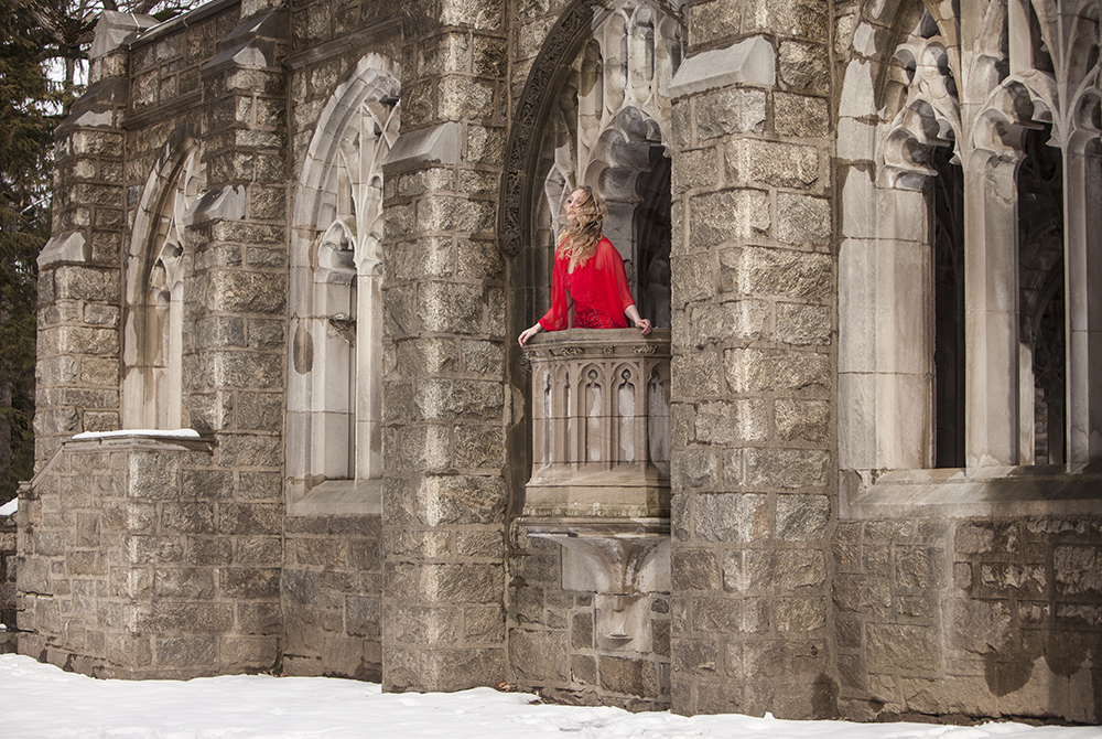
I created "Her Majesty Waits" while shooting with a handful of my photography friends last winter at this beautiful church in Valley Forge National Historical Park here in Pennsylvania. I really loved this little balcony of sorts with these intricate arches and pillars surrounding it. I didn't think it would be much of a stretch to use this location as a castle. All I needed now was a princess!
We had Elizabeth Post, a local model, with us to be in our creations, so I asked her to don a fancy beaded red dress and we were ready to get shooting. She was a total trooper. You'd never know from looking at the final image that it was in fact a cold winter day with snow on the ground; Elizabeth had to be absolutely freezing!!! She never complained once. It was actually a fairly quick shoot. I knew exactly what I was going for, plus I wanted Elizabeth to leave there with all of her fingers and toes attached, unfrozen, and still fully functioning. I had her quickly look longingly for her prince, whip her hair around a bit, and boom we were done. NOW PUT A DANG COAT ON GIRL!

Minus a couple wider shots that I used to expand my frame, these are all of the images I took. I'm rather tickled by Julie's adorable little cameo in this gif. (Please note that she is wearing the proper attire for the temperature that day.)
Costume Color Choice
Right off the bat Elizabeth was going to stand out to some degree because she was the only thing in the otherwise fairly monochromatic image that was bright-ass red. Obviously you can't ALWAYS use a shockingly red garment (unless that's your shtick, then by all means have at it), but one great way to quickly make your subject stand out (before you even touch Photoshop) is to have them wear something that drastically contrasts with their surroundings.
CUT IT OUT!
This is a "tip" I've given countless times before and this will not be the last time I say it (#sorrynotsorry). Please do yourself a favor and take the extra time to get a very detailed selection of your subject with the pen tool. Clearly you'd do this when compositing a person onto a different background, but most people don't think about selecting their subject when they're already in the actual setting right from the get go. There are many techniques that can be applied once you have your subject carefully selected that can really make them shine.

Paint It Black
Since I already had Elizabeth selected (because duh), I was able to easily fill the area around her with black. Nothing too fancy, I literally just used the paint bucket tool to fill a new layer with solid black "paint." Then I turned the layer's opacity down to around 25% and right away she was standing out from the background more. I've used this same trick on several other images. (Like this one, and this one, and definitely this one!) It's just such a simple thing to do that most wouldn't think to even do it, but it's pretty dang effective. You could set the black layer to "soft light" or "overlay" or something. You could even use your selection to darken a curves layer if you'd like, but there's just something about the way this regular black layer looks that I'm quite fond of.

The left image is "before", the middle is the layer filled with black, and the right is the "after" version with the opacity of the black turned down. Simple, subtle, but effective!
Beautiful Blurrrr
One of the last things I love to do on an image like this is some crafty blurring. First I'll duplicate my image, then load the selection of my subject (have I mentioned how important a good selection is yet? No? Yes? Maybe once or twice?), then "select inverse" so I have everything around them selected like I did for the black layer. In the case of this image I also selected the balcony because I wanted that to remain in focus as well. Then I apply a "Lens Blur" filter.

This helped the image out a TON, and really aided in making her pop. In my original picture the focus was pretty broad; the stone details behind her head were just about as in focus as she was. You can also apply some subtle sharpening to just your subject to even further the shallower depth of field effect you're creating.
Selective Color Correction
While editing, it became quite apparent that although her outfit already really stood out, her hair and skin were roughly the same color range and tone as the background. Obviously you could see her and know where her head was - It's not like anyone was going to look at the image and be like, "Whoa where the heck is her head!?!?! What a terrible picture ... that's it I'm leaving!" But if this were an illustration (which is kinda how I treat my images), I would never have painted the backdrop right around her head with a similar color and brightness to that of her hair.

Since you already have that very good selection of your subject, you can affect its colors separately from that of the background. Seeing as her hair is a golden yellow color, I decided to make the background behind her head a bit more purple/blue-ish to get some separation. I did some painting with darker purple tones on a new layer set to "overlay." I also used a couple of adjustment layers like "Selective Color," with which I could affect just the blacks and push a bit more blue and magenta into the shadows.
There are tons of different ways you can alter your subject from the background, just be sure that you don't take their surroundings toooo far from that of your character or it's going to start to look fake and over-edited. (Some might say all of my work is over-edited, to which I say "Screw you I'll make the art I want to make and what the heck are you doing here anyway Mr. Complainy-Troll-Pants?") We don't want it to look like a bad composite, appearing as though your subject was sloppily placed onto that background when you took the time to actually go shoot on location in the first place. It should still look like the person is in fact in that setting, we just want them to stand out a bit, that's all.
