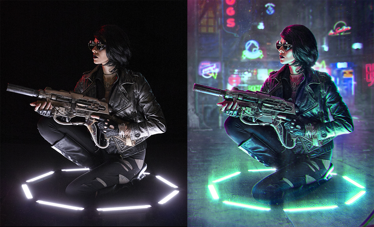
For all those who are reading the title of this article and thinking to themselves, “What the crap is Cyberpunk?” … Well, according to the dictionary it is, “A genre of science fiction set in a lawless subculture of an oppressive society dominated by computer technology.” Just think “Blade Runner” and you’ve got the gist of it. As much as I love (and will obviously always love) to create stereotypical fantasy art, I’ve recently been super inspired to create artwork that leans on Cyberpunk themes. What’s not to love about neon lights, shiny leather, sunglasses at night, glowing technology, and in-your-face vibrant colors popping out of the dark moodiness of a dystopian futuristic city!?
So, you want to craft some cyberpunk images of your own, do you? Well, you’ve come to the right place, my friends. Below you will discover five photography/Photoshop tips and tricks to start your gears a-turn-in. Let’s get creating!!
1 - START WITH INTERESTING LIGHTING
Due to the fact that cyberpunk stories usually take place in grungy cityscapes with bright neon accents sprinkled all over the place, you can pull off some fun lighting setups that might not normally make sense. This is the perfect time to bust out the colored gels and go a little overboard. I find the colored light looks especially awesome for edge lighting; also it’s a safe bet to have opposite colors on different sides. Thanks to Photoshop you can always change the hues later - so just by having a drastic splash of color here and there, it will be easy to alter the tones in post if need be.
Also, remember that lights don’t always have to come from the typical directions you’d usually adhere to for a “normal” portrait. Obviously for my image I decided to have my main light source coming from below. I thought it would be cool if she were crouched in a circle of light that could be some sort of force field, or maybe she just arrived on the scene via fancy sci-fi teleportation.
For this picture I made use of this really awesome set of “Spekular Lights” from Spiffy Gear. Guys, seriously they are my new favorite toy. They’re like LED legos … aka you can connect them together however your little heart desires. I combined 8 lights to make a large ring light, but you can piece them together in a bunch of different ways: boxes, triangles, long strands, a starburst - basically if you can think of a shape, you can make it out of these lights. I’m obsessed. Ob-sessed. (Feel free to snag your very own set here. You know, if that sounds like a thing you’d want to do.)
2 - FIND THE PERFECT FUTURISTIC BACKGROUND
As I mentioned before, the stereotypical environment for anything cyberpunk is a tech-heavy city, so your best bet is to start with some sort of urban imagery, particularly at night. Lots of colors and lights are a plus, but those can always be added in later.
Another aspect of Cyberpunk is that it usually has a hefty Asian influence. Starting with some place like Tokyo is probably a good plan. Unfortunately, I’ve not made it to any part of Asia just yet, so I ended up using a CG rendered background that was literally handmade to be a cyberpunk city. “Isn’t that cheating?” Why yes, of course it is … but it’s fine because you can cheat too!!
The background I used is from here, so you can 100% use it as well if you’d like. There are even a handful of others with it. (I used one of the others from the set for this image if you want to see a different one.) They are pretty darn cool because, due to the fact that they are CG, just about every light is on its own layer. This allows you to turn each light on and off to create the ideal lighting situation in order to match your shot. Or you can pop it open while you’re shooting, find a balance of layers that you like and then set up your lighting to match.
3 - NEON LIGHTS GALORE
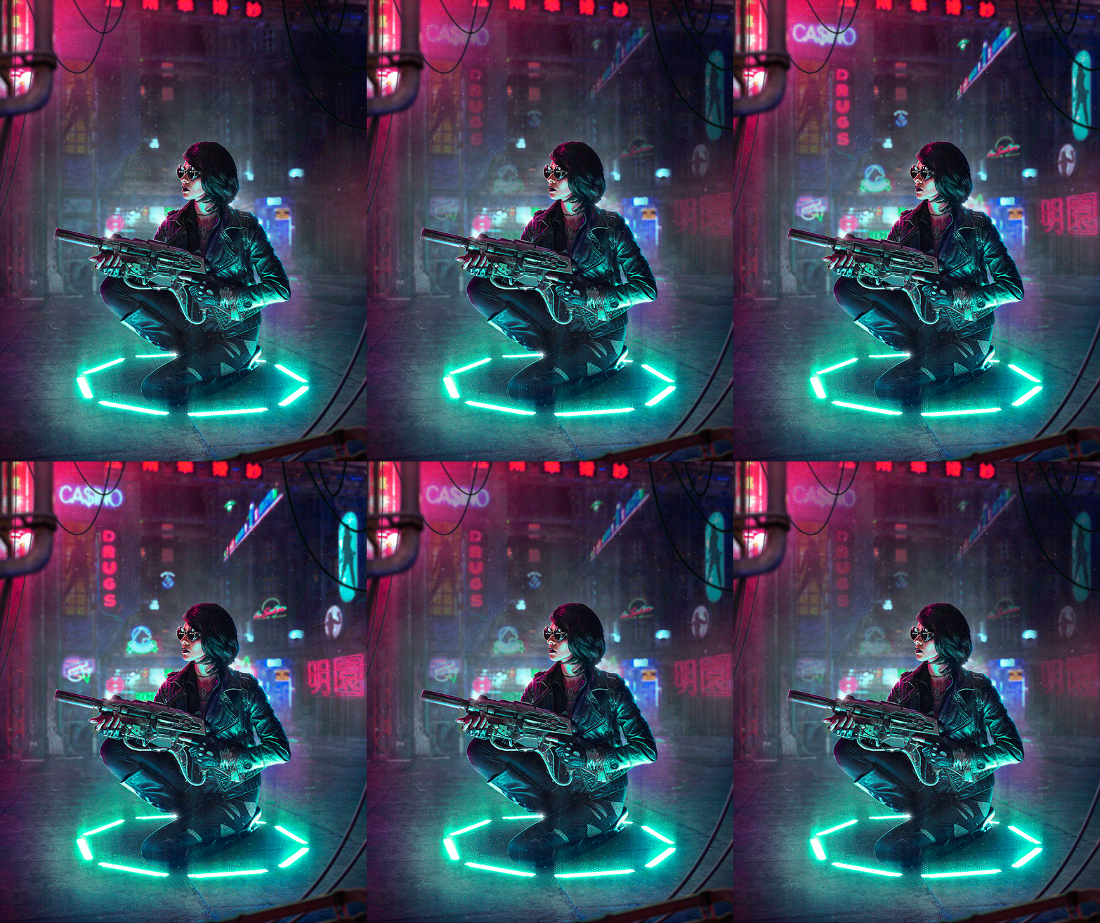
One of my favorite parts about editing this image was adding in more and more neon lights. It helped that the background I started with was already in the cyberpunk realm, but you don’t by any means have to start with a CG cyberpunk city. If you decide to use an image of an actual city as a base, you can always edit in the vibrant colors to the existing lights in the scene and then slap on some neon signs to build up your very own cyberpunk location.
It’s super easy to Photoshop in the extra neon lights by setting them to the “screen” blending mode - this makes it so the dark pixels of that layer are transparent. You just have to decide where each one fits best into the puzzle of your image, as you’ll want to find the right balance of colors and placement so your compositions flows nicely.
A few things to watch out for: most often you’ll need to mask away the edges of the neon light images. Even though the dark pixels around the neon will be transparent when in the “screen” blending mode, you’ll usually end up with a faint box around the light since the background is almost never totally black. Also, be sure you are matching perspective - If you want to put a light on the side of a building, you’ll have to transform and skew it to match the angles of that side of the building so it looks like it’s actually on the surface. Lastly, if you blur the background like I did, be sure to give the neon signs the same blur effect so it looks believable.
4 - CHECK YOUR VALUES IN BLACK AND WHITE
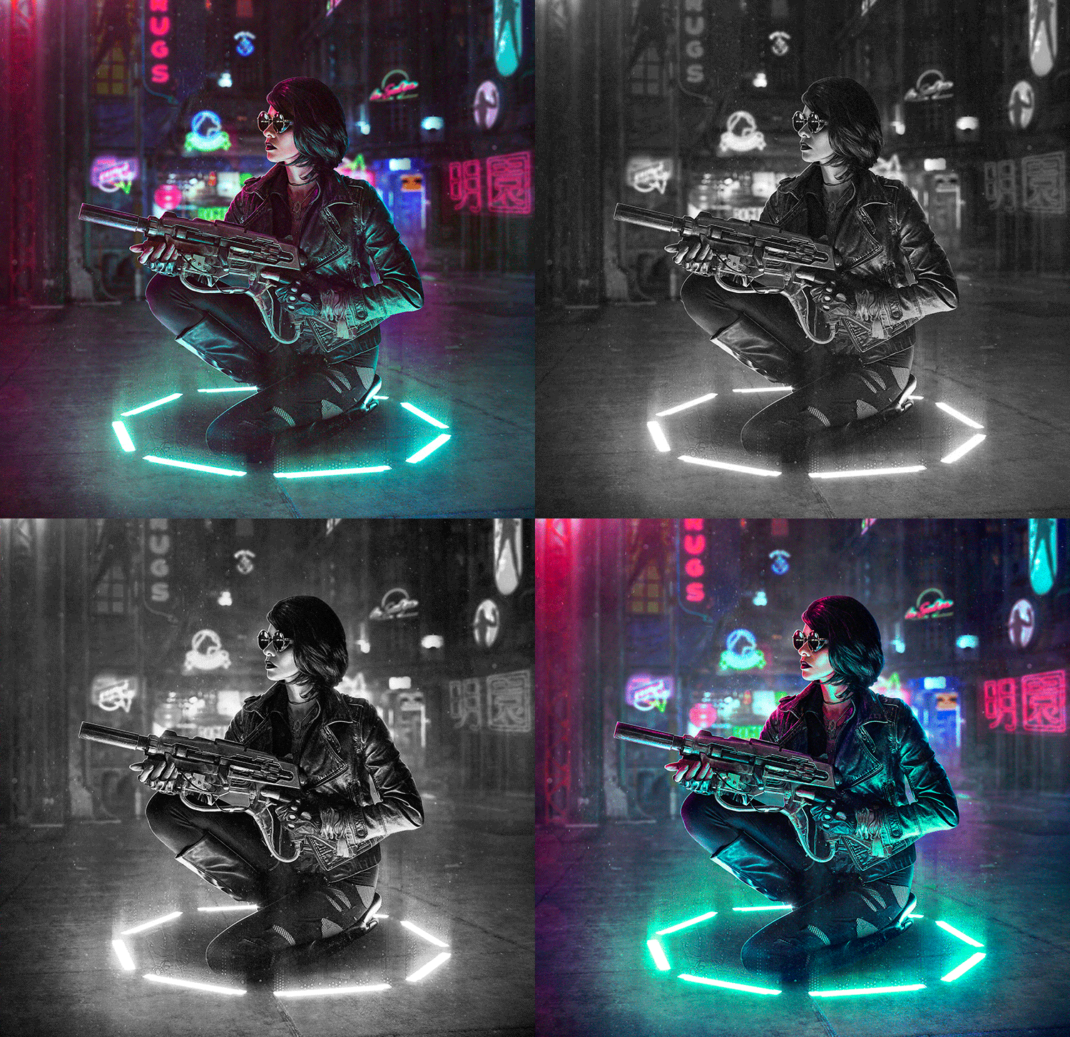
This is a technique I employ at some point (or many points) in just about every edit I work on, but it’s especially pertinent for images like this with drastically different colors affecting how you perceive things. It can be easy to think the subject is standing out against the background well enough if their hue is different from that of the backdrop, but in reality the values of the image might in fact be too similar. You want to be sure the image isn’t actually super flat. Don’t get me wrong, having your subject’s face bathed in neon pink light will certainly make them stand out against a teal background, but it can only do so much. Bright pink and bright teal can actually look exactly the same in black and white if they have the same value, as in their darkness and lightness values. You need to break up the image with different areas of light and dark to make it visually dynamic. The darkness, lightness, and overall contrast of the image is what can really make it pop.
What I do to check this is to make a new layer on top of all my others and fill it with black (hit “D” on the keyboard to set your foreground color to black), then set the blending mode to “color.” This will ONLY affect the colors of the image and not mess with the brightness values so you can accurately see what you’re working with and adjust your values accordingly.
Once I switched over to black and white it became more apparent that my subject did indeed require some extra separation from the background. On a new layer behind my subject, I used a cloud/smoke brush from this set and painted with white at about 10% opacity to build up some atmosphere. I figured the city could be a bit smoggy, plus the farther away something in an image is, the lighter it will appear - because science. I also painted with white on an “overlay” layer to bring up some of the highlights on the areas and details I wanted to stand out more. Then I tweaked the overall contrast to make it slightly punchier.
Top left is before checking values. Top right is after adjusting the values. The bottom two are the same as the top two but devoid of color.
It’s super fun once you’ve done some tweaking in black and white to turn the black layer off to reveal the color again and see how it looks. I always leave that solid black layer at the top and check my values several more times throughout the process. It’s a great way to sort of get fresh eyes on your image.
5 - CREATE SOME CHROMATIC ABERRATION
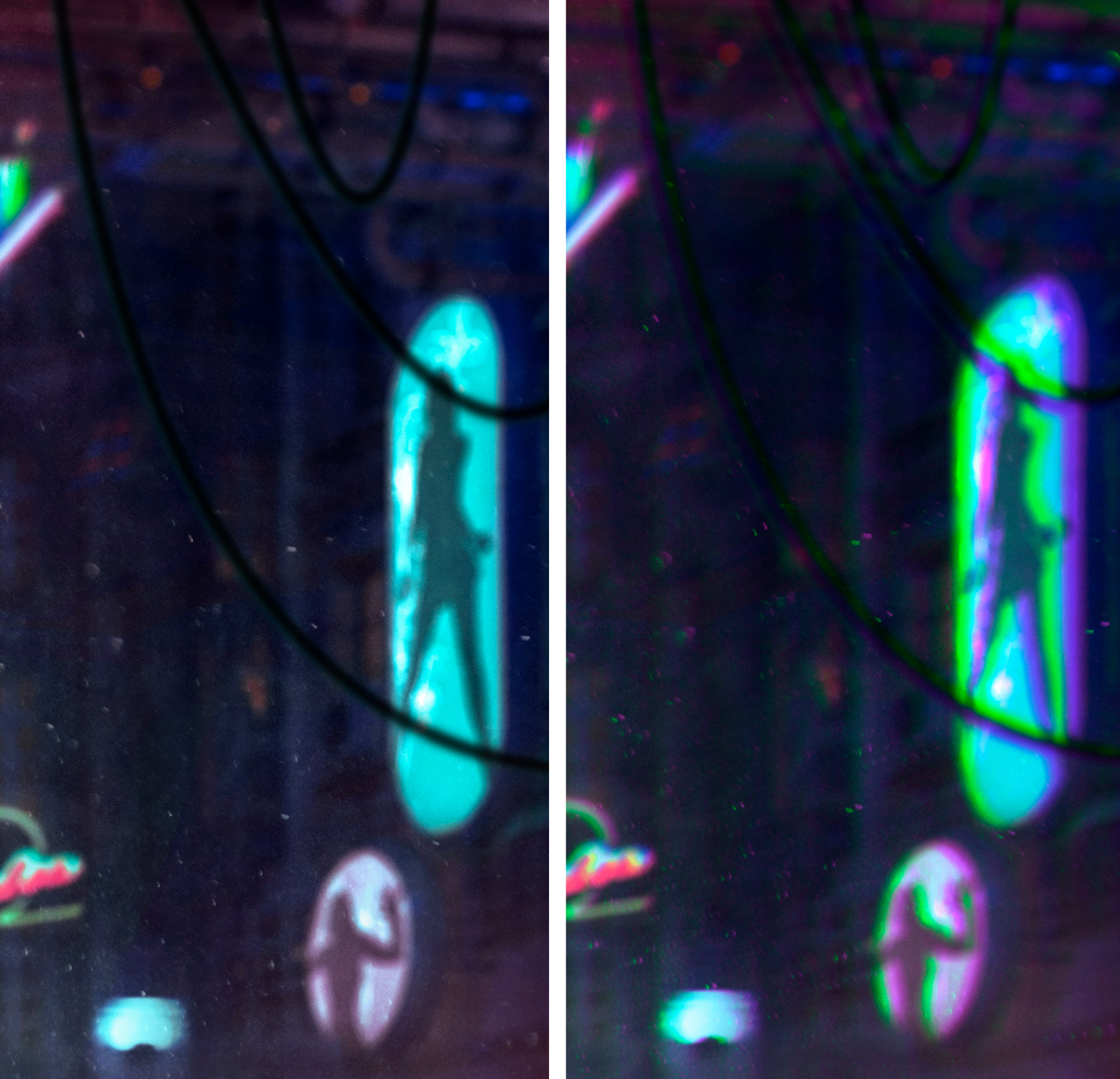
Chromatic aberration is when a lens doesn’t line up all of the color wave lengths to the same point, so you get color fringing on the edges of things. In other words, the color channels are ever so slightly shifted one way or the other and don’t meet perfectly at the same point for even color distribution. Normally photographers are finding different ways to eliminate this from their photos .… leave it to me to want to add it on purpose hahah.
Chromatic aberration is technically digital distortion, and that just feels so perfectly fitting for a cyberpunk image. I love the effect it gives and the fact that it can help to further blend all of the various components I’ve composited together. Since it’s an effect that a camera can produce on an actual photograph, by adding it to my finished composite it can tell the viewer that all these pieces were “actually” in front of the camera and not faked together in Photoshop ... well I want it to say that, anyway.
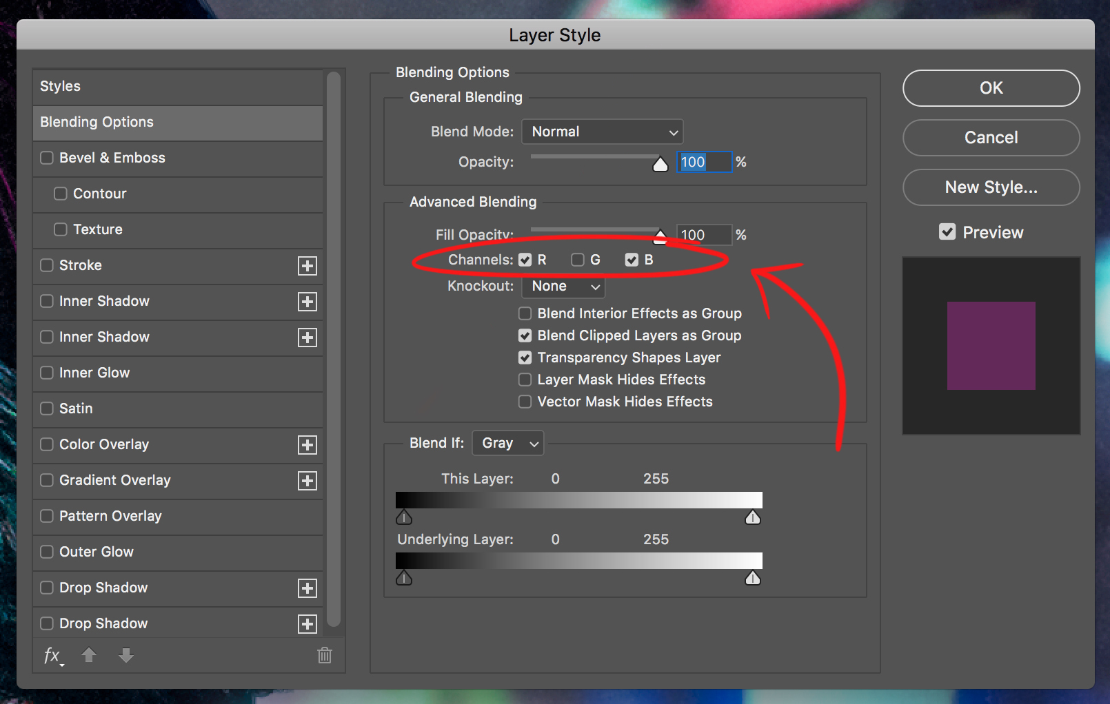
I’m sure there are tons of ways to get the job done, but I go about it by using the Layer Styles pop-up palette. First thing you’ll want to do is create a “stamp visible” of your finished image so you have a flat copy of everything on top of all your layers. Next, double click on this new layer to bring up the Layer Styles palette (or right click the layer and go up to “blending options”). This is where it get’s complicated … jk it’s stupid easy. Just turn off one of the color channels in the middle of the palette. (Note that you can always come back later and try turning different channels off and on to get different color variations.)
You can go about the second part of this effect a bunch of different ways. Essentially all you need to do is move that layer in some fashion so it no longer lines up with the image below and it will give you the off-kilter-colors-effect we are going for. This can be achieved by simply moving the layer one way a little, perhaps stretch it larger, or maybe even rotate it a tiny bit. You can do a warp transform and pull the corners out a bit, heck even mess around with the distortion filters - so long as you move the pixels somehow, you’ll see the effect in action.
I used the Lens Correction filter to …. un-correct the lens and get the effect how I liked it. If you click the “Custom” tab at the top of the Lens Correction filter (see above image), you can then slide the top slider to the left or right to warp the image. You don’t need to go too crazy; a tiny bit will make a big difference. I like the way using the Lens Correction makes the effect gradually more drastic the farther you get out to the edges. Once I applied the filter I then added a layer mask to take the effect off the face and a little off the body since it was a bit distracting.
Well, there you have it: my five tips for creating a badass cyberpunk masterpiece. If that just wasn’t enough for you, fear not for I’ve also recorded a speed edit video in which I talk through my whole process. If you’re sitting there thinking, “Thanks Robert, this is all fun and exciting, and I really want to try my hand at all these editing tricks, but I don’t have a model, fancy outfit, nifty gun, spiffy lights, nor the time and space to shoot my own cyberpunk pictures.” Well, I’ve got you covered friends. YOU CAN EDIT MY PHOTOS!! That’s right, for the first time ever you can now obtain images I shot and edit them yourself. If you do decide to have a go at one of my shots please tag me so I can see what you do!! I’m @robertcorneliusphotography just about everywhere (I know, longest handle ever, but all the shorter variations were taken … ) Happy Cyberpunk-ing, everyone!

